How to Optimize Website Navigation?
January 25 - 3 year before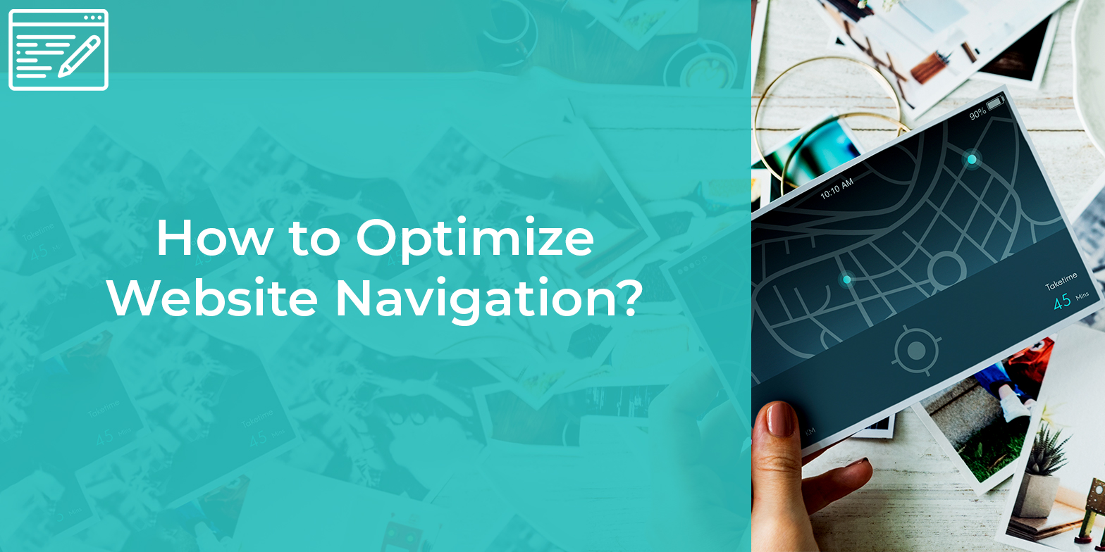
Website navigation can either make or break the experience of your site visitor. The websites that can provide an engaging experience to your site visitors are considered more engaging websites. Website navigation is considered as an aspect that can offer a promising experience to your website visitors.
Any website without a logical and planned navigational plan can drop the experience of your site visitor in the middle. However, it is also not that much difficult to create a good website navigation menu. Hence, here we have come up with some amazing tips that can turn the negative site experience of your visit into the positive one.
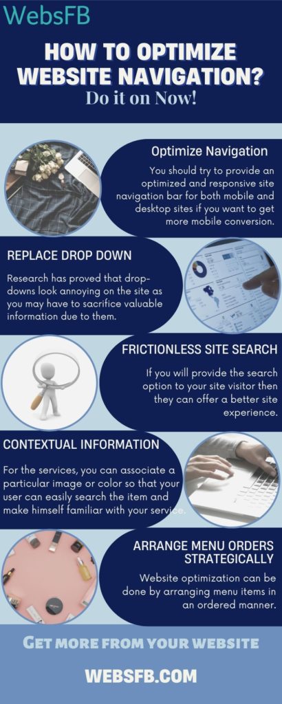
Best Practices to Plan Website Navigation Menu
1. Optimization of Website Navigation
Websites with a mobile-responsive navigation menu are highly recommended. Today users want to have a better mobile-user experience along with a desktop experience. You should try to provide an optimized and responsive site navigation bar for both mobile and desktop sites if you want to get more mobile conversion.
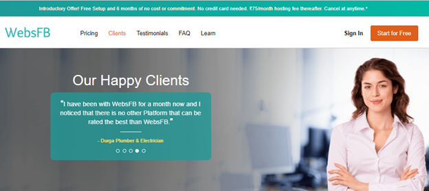
By simplifying the website navigation bar of the mobile version of your site you can provide a better user experience to the site user. You can also move some unessential information to the footer. Website optimization can be done through a properly optimized website menu bar for both header and footer.
2. Replace Drop-Down Menu
While it is convenient to use a drop-down menu but sometimes it may be more complex, extensive, or unfamiliar that can be replaced by an additional informational page. Research has proved that drop-downs look annoying on the site as you may have to sacrifice valuable information due to them.
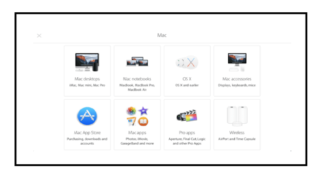
Apple-like big business giants have revised their website navigation to provide a better support menu. They created an entire page for each product category. By doing so they have provided a convenient way for their users through which their users can navigate all product categories.
3. Frictionless Site Search
The sites with a site search option have two times more conversion rates than those without a search option. If you will provide the search option to your site visitor then they can offer a better site experience.
There are many examples of such sites like Airbnb or IKEA or WebsFB are the one. The search box on these sites loads as the first element. This indeed encourages the visitors to interact with the site. Moreover, make sure that your site user will find everything whatever they will search on your site. Websites usually put very little important information on their home page, especially in the mobile version of their site with a search bar only.
4. Avail Contextual Information
If you want that your user can get the right and desired information in a single click, then you can inculcate some information in the drop-down menu as well. This clue can be any visual or a handy icon or any piece of information helpful to your user. For the several categories or services, you can associate a particular image or color so that your user can easily search the item and make himself familiar with your service.
5. Arrange Menu Orders Strategically
If you have a vast menu on your site, then try to order the services strategically. As per research people usually remember the first and last thing in the menu, while designing the website navigation you can consider this fact and put the important facts and services as the first option. Website optimization can be done by arranging menu items in an ordered manner.
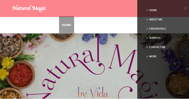
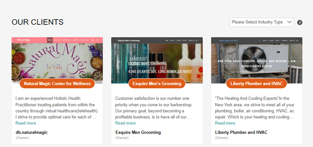
One of the WebsFB clients has kept the service menu in a strategic way so that the customers can access the service efficiently. The services kept at the beginning always drive more visitors to your site. Choosing the menu order strategically can showcase and order the services perfectly and provide better access to your service to your user. The most important links can be either placed at the first or the last position of your menu.
Making Website Navigation Seamless
If you want to give a more user-friendly experience to your site user then it is important to spend some time designing website navigation. Don’t underestimate the site navigation, even try to give it proper time so that your site user can know about your service and product perfectly and get a closer look at that.
However, at WebsFB you will always find an edit option for your website navigation. Through that option, you can anytime redesign or reorder the menu options. Try to design an optimized and ordered menu or website navigation for your small business website.
-
Subscribe to Stay Updated with Latest News
Easy 7 steps for build your website.

Select Template
Choose Color
Add Logo
Add Navigation
Setup Account
Add Content
Go LIVE!
Categories
- Blogging Platform (1)
- Business (26)
- Development (24)
- Email Marketing (8)
- Graphic Design Trends (4)
- Hosting Platforms (1)
- How To's (18)
- Ideas and Inspiration (3)
- Inspiration Technology (5)
- Management (2)
- Marketing (38)
- New Features (10)
- News (25)
- Online Advertising (3)
- Promote Your Website (27)
- Search Engine Optimization (8)
- Security (4)
- Small Business Tips (43)
- Social Media (6)
- Uncategorized (2)
- User Experience (3)
- Web Design (42)


